The Postcard Coast: Why a Pretty View Can Flatten a Story
Postcard coast imagery can make a film feel generic. Learn how framing, colour and composition turn a beautiful shoreline into a deliberate visual choice.
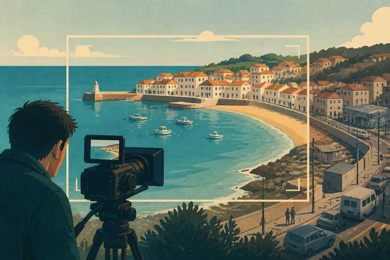
The most common mistake with postcard coast imagery is assuming a beautiful frame has already said something. A turquoise bay and neat row of white houses can signal a holiday at a glance, but they can also make one shoreline interchangeable with another. The image becomes more interesting when the film treats it as a visual construction, shaped by framing, colour and composition.
That construction can be sincere, playful or uneasy. A film may invite us to enjoy the view, reveal how carefully it has been arranged, or let a character’s gaze disturb its polish. The question is not whether the coast is beautiful. It is what the camera’s version of beauty asks us to believe.
How does framing make a coast look like a postcard?
A postcard frame tends to simplify. The horizon sits cleanly across the image, bright water fills the foreground, and buildings or cliffs provide an attractive edge. A wide shot can make a place feel open and inviting; a centred composition can give a harbour or beach the poised stillness of a souvenir image.
Those choices are not neutral. A camera can crop out a road, a car park or a working area, leaving a view that feels untouched. It can also hold the composition long enough for the audience to admire it, then cut abruptly to a busier or less polished image. The contrast makes the first frame feel selected rather than complete.
Think about what lies just beyond the edges. A close crop can preserve the fantasy of a pristine beach, while a wider frame may include the promenade and the people moving through it. Neither is inherently more truthful; each gives the audience a different picture to read.
What can colour and light tell us?
Bright blues, pale stone and warm sunlight can create the visual shorthand of an ideal summer coast. Muted colour or flat light can make a similar view feel distant, quiet or familiar. A film’s palette may also shift as a character’s expectations change, without needing dialogue to announce the change.
Light can make a familiar place seem staged or fleeting. Hard midday sun sharpens edges and washes out subtle texture; low light may soften the same shoreline and draw attention to reflections. These are visual possibilities, not fixed meanings: a director can use bright colour to suggest unease or grey light to make a place feel comforting.
When watching, notice whether the film keeps its coastal colours consistent or lets them change between scenes. A sudden shift may reflect a new mood, a different source of light or a deliberate break from the polished image the film first presented.
How do camera movement and editing alter the view?
A slow pan can invite the eye to browse the coast, much like a visitor taking in a view. A locked-off shot can make the image feel composed and still. Handheld movement or a quick cut may interrupt that calm, bringing the audience closer to a character’s immediate experience.
Editing also determines how long a scenic image has to work. A lingering shot can turn a location into an attraction in its own right. A brief glimpse between conversations may make the view feel incidental, while a repeated composition can gain a different meaning as the story changes.
Say an invented short film opens with a static, carefully centred view of a harbour, with blue water and boats filling the frame. Later, the director repeats the composition but cuts away before the audience can settle into it, then returns to a closer shot of the same boats rocking in the wind. The starting image offered a composed spectacle; the later shots make that polished view feel temporary and less controlled.
How can you read postcard coast imagery?
Why can a coastal shot feel staged?
A clean composition, strong symmetry or unusually tidy frame can make the image feel deliberately arranged. Look at what has been left out and whether the film draws attention to that selection.
Does a postcard-style shot always romanticise a place?
No. It can express a character’s longing, set up a visual joke or establish an image that later scenes complicate. Its effect depends on how the film places the shot alongside other images.
What should you notice about colour in a seaside film?
Watch for repeated colours, shifts in saturation and changes in light between scenes. These choices can shape mood, but they do not have one universal meaning.
How does editing change the effect of a scenic view?
Consider how long the shot lasts, what comes before it and what follows. A long view may invite admiration, while a sharp cut or repeated framing can make the same image feel ironic, fragile or newly significant.
Which visual choices should you check?
Use these observations to decide what a coastal image is doing, rather than treating beauty as a complete explanation:
- Check the frame edges: if roads, buildings or crowds are cropped out, decide whether the film is creating an idealised view or simply keeping attention on a character.
- Check the horizon and balance: if the image is carefully centred or symmetrical, decide whether that composure suits the scene or should be unsettled by a different angle.
- Check the palette: if blues and warm tones dominate, decide whether they reinforce the character’s mood or make the scene feel like a deliberate visual fantasy.
- Check the light: if the coast appears softened, glaring or flat, decide whether that quality supports the intended atmosphere or calls for a contrast in another scene.
- Check camera movement: if the shot glides or pans smoothly, decide whether the audience should browse the view or whether a more immediate movement would fit the moment.
- Check shot duration: if the view lingers, decide whether its spectacle earns that time or whether a quicker cut would keep the scene’s focus elsewhere.
- Check what follows: if the next image contradicts the postcard frame, decide whether the contrast clarifies the film’s perspective or feels disconnected.
Postcard coast imagery is easiest to read when you look at the choices that build it: what enters the frame, how colour and light shape it, and how long the film asks you to stay. A beautiful view can be an invitation, an artifice or both; the cut that follows often tells you which possibility matters most.